
Designing a logo for yourself is one of the hardest assignments of you will ever have.
Graphic designers by nature are meticulous and on top of that being your own client can be difficult. So the logo idea began with “d”. It’s been my nickname since I was little and it’s also the first letter in the word design so I decided to make a custom letter so it’s like no other that exists.
My goal : strong, timeless, & simple.
I have loved typography, since my college professor John Clark taught me how to typeset copy with the old metal letterpresses in college. Fun fact for you younger designers: the words kerning and leading that you are familiar with, they came from the two fundamental ways of manipulating the space between characters that impact readability and legibility of type.
Bad designers steal & good designers borrow.
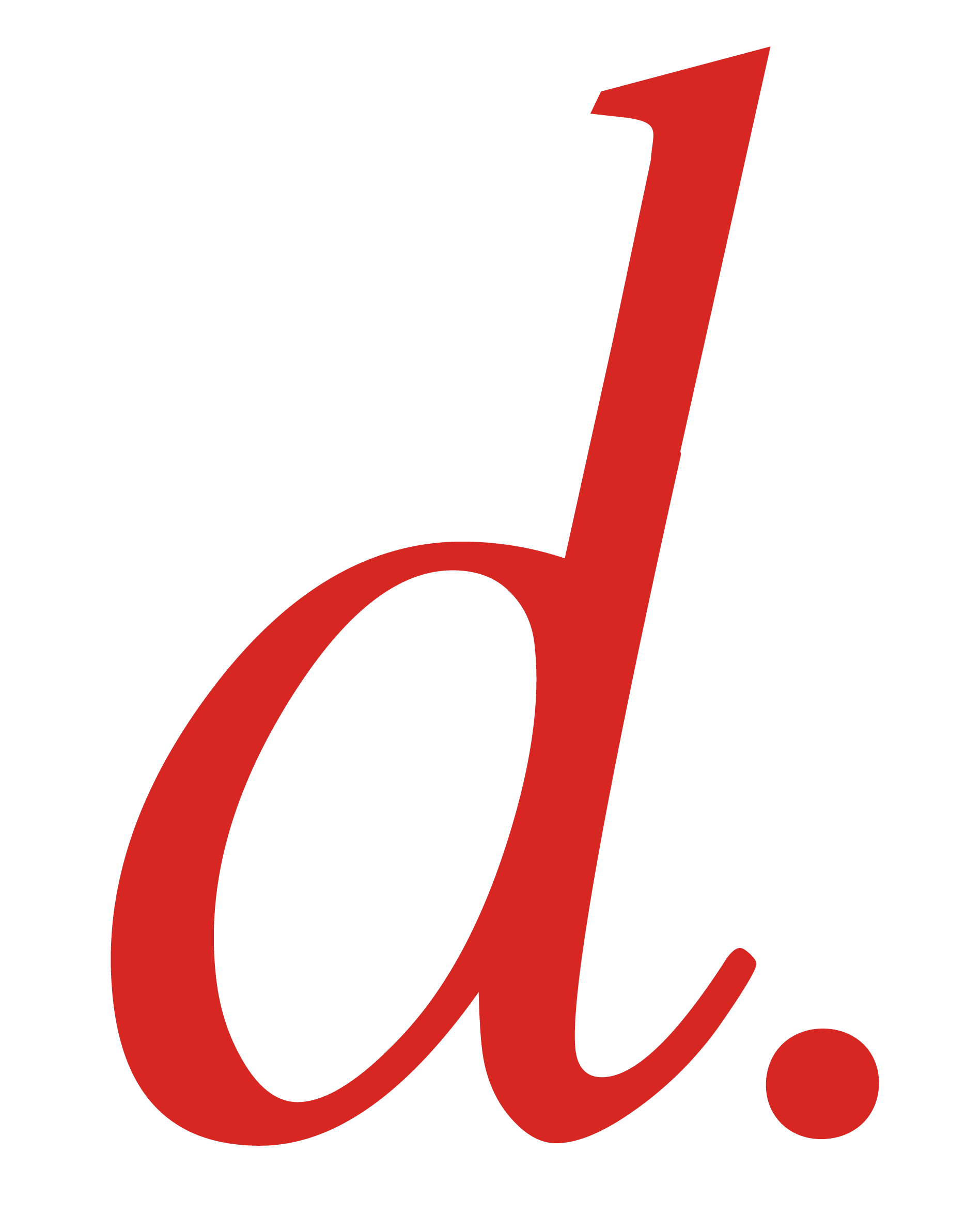
I decide to start with elements of my favorite classic serif fonts to use as my foundation because they represent sustainability in great typeface design.
I love clean modulation and elements that pay homage a calligraphy stroke in a typeface.
I chose the ascender on Garamond Regular and the body of Bell MT’s italic lower case as the winning parts to be combined. From there you can see how I made small adjustments to the slant of the bottom & top. The ear of the ascender was given a shorter beak and the base's curves and angles where smoothed out by hand.
Below are all the final design options I created for a possible personal logo.
I chose the custom lower case "d" because of it's simplicity. If you didn't click on the logo in my navigation you probably would've assumed I just typed a letter, colored it red and made it into my logo.
