2005 Christmas Postcard Mailer - I received straight A's in all of my 2004-2005 classes. Throughout high school I had always averaged B's in most of my classes so with this end of the year card I wanted to highlight that with graphic design being my educational focus in college; on top of working at UD printing & design part time, being on yearbook committee, and representing the student body in UD's Student Government, I was able to be the student and leader I always knew I was.
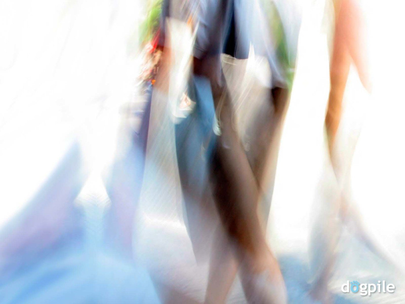
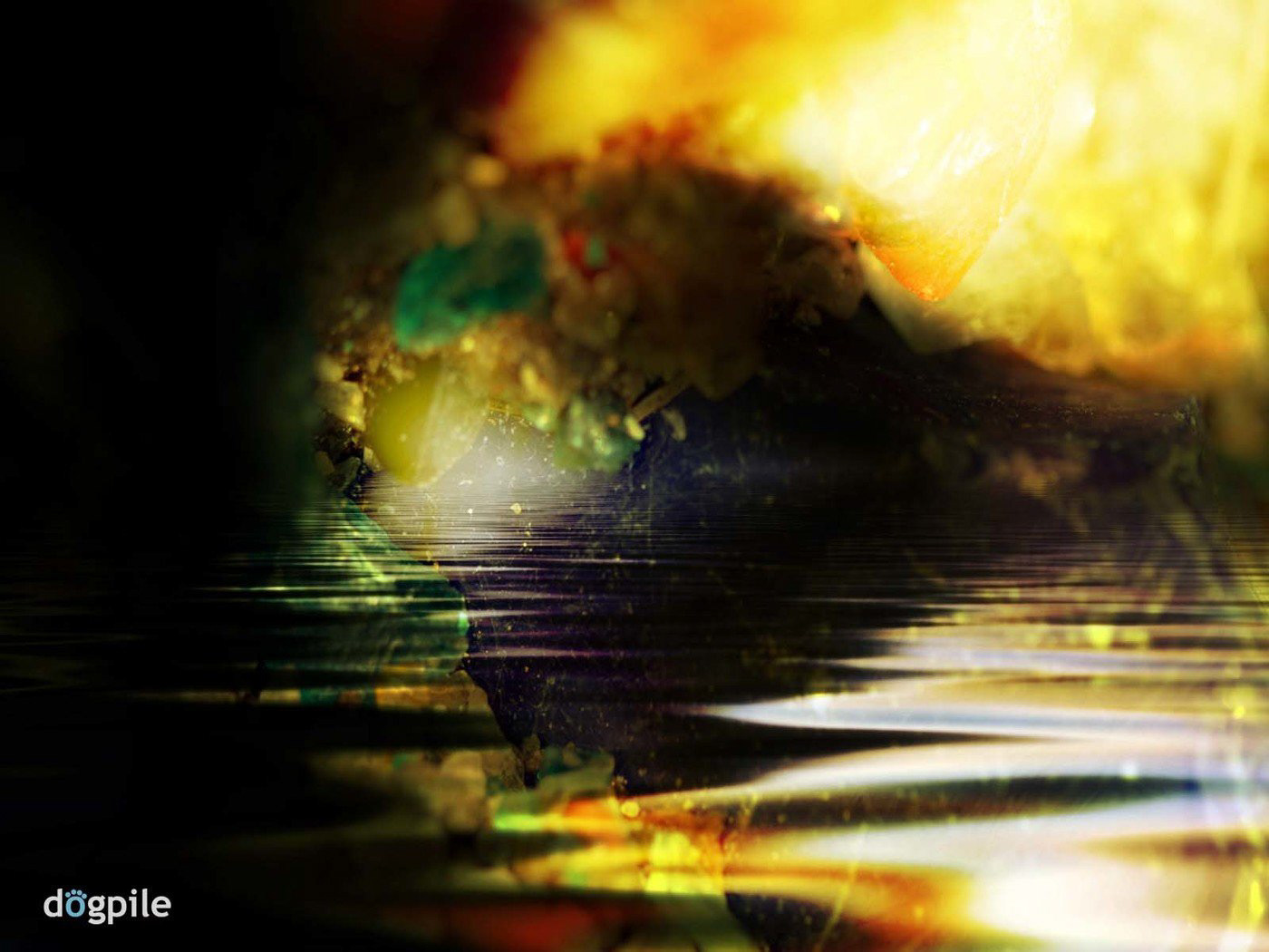
These two wallpapers were my first freelance project while at UD. Dogpile.com was asked all design students to submit 5 original ideas for their launch. I scanned in two images from my new Nikon SLR that I used in my college photography classes. I then played in photoshop for a bit: manipulated color, multiplied texture, overlays, and used dodge/burn to get the effects I wanted.
At the end of school year I had 200 dollars left in my design budget, so I decided to use the money to get tees printed. I gave them as a gift to SGA members at the awards banquet for a successful and fun 2005.
Front: sga UD Back: "U can talk about making a difference or U can make a difference." "U" & "D" in red.
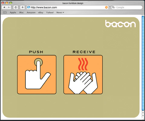
Loader - Welcome

Navagation
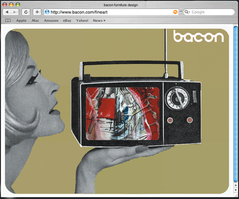
Art Work Scroll Through
Bacon Furniture Design - Bacon is a furniture company started in Dayton, Ohio. The ask: a website that was fun, interactive, and unexpected, just like the designs they sold. I went with a simple but fun color palette for the site, with retro black & white photography layered into the nostalgic look and feel.
Virgin Records Poster Triptych - Project for History of Graphic Design Class. This Series I designed in the 1950's Swiss Style influenced by Josef Müller-Brockmann, I was tasked with making it look relevant to my demographic and still keeping the iconic colors of the brand. Looking back I think I was ahead of trend since the apple ipod ads with the sillouhetted figures came out a few years later.
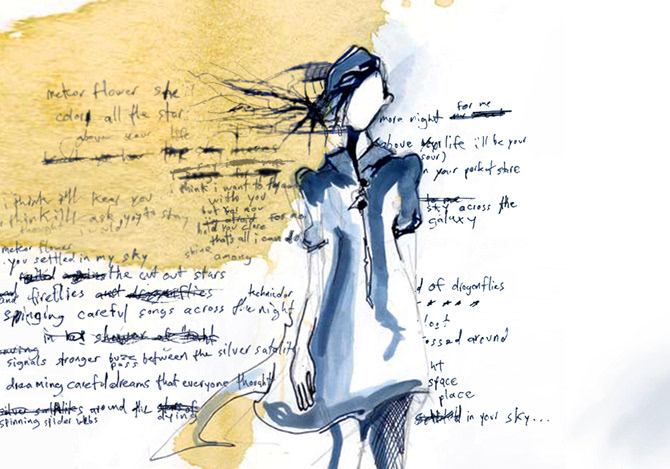

Here are two of my "Identity vs. Illusion" book spreads. The ask of this Graphic Design II assignment was to choose a word that has varied meanings and create a book taking you on a journey to look at it's multiple interpretations. I choose "Makeup" as my word. I love the dichotomy of what it can mean in different contexts. The book explores the copious associations our culture has with inner beauty and the strive for appearance of perfection. Genetic makeup, cosmetic makeup, or the looking at people who makeup stories to make themself fit in or stand out. I used my friend's diary, my sketchbook, my drawings of friends, some typography layouts cut up and rescanned to create the spreads. I loved incorporating the visual of spilling ink, coffee, tears as visual links to being vulnerable & imperfect mixed with negative space left for growth in each.
Green Eggs & Glam- This is the loader to my clothing site that I started in 2005.
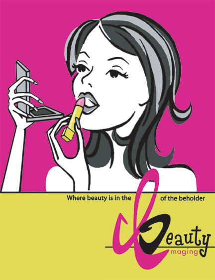
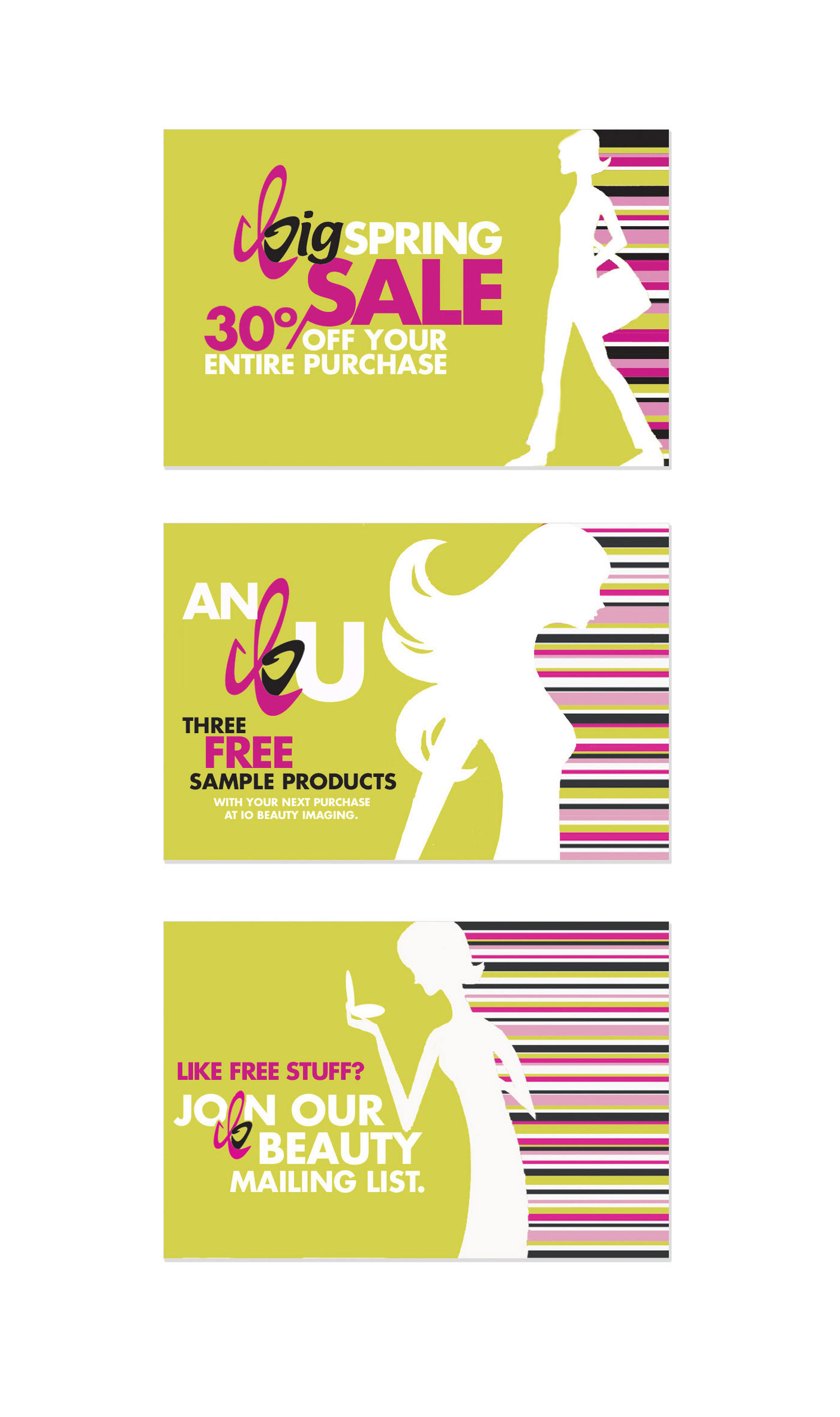
IO Beauty Imaging Ad & IO Beauty Imaging Direct Mailer Designs. The name IO Beauty Imaging was given to our Illustration in Graphic Design class and we were to create a logo, stationary, an advertisement, and packaging using no photos. I choose to market my company towards the tween demographic, using fun and bold fonts and bright colors and illustration.
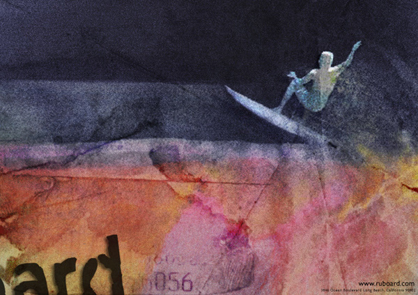
Board Museum OOH ad - This would be on the metro trains going from San Diego to La Jolla (where this fictional muesum of mine was located) with the focus being the art and not the call to action. At this point in college I was very influenced by David Carson's work, specifically his book "the end of print" so I tried my best to mimic his surfer-esque graphic style.
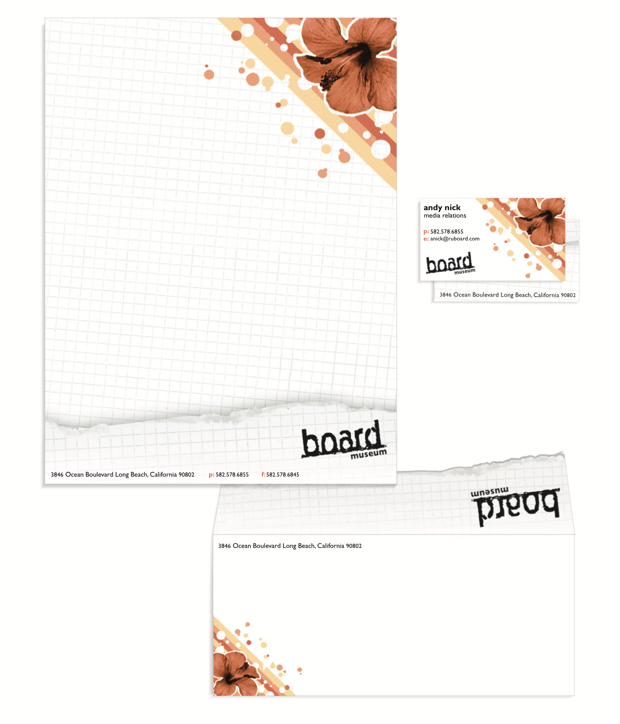
Board Museum Logo & Letterhead - The "museum" project conceptualized profile: a collection of record-breaking & historic boards, as well as a walk-through of the complete history of skating, surfing, & snowboarding, from the founders to the counter-culture that developed from each. It also has a gallery where a board designer is featured each month, & simulation rooms for a virtual experience of each sport. In the museum shop trained professionals work to help visitors pick the right board for their lifestyle.
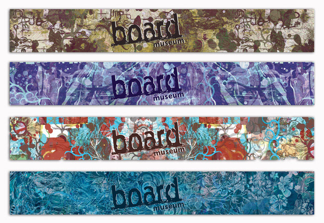
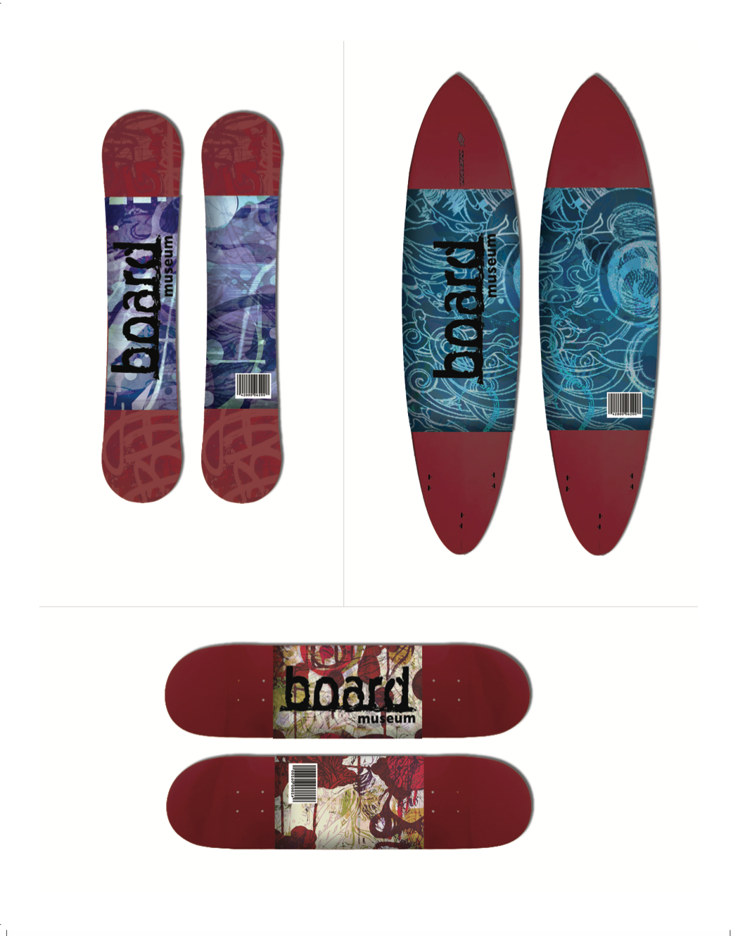
Board Museum Packaging - In the museum shop trained professionals work to help visitors pick the right board for their lifestyle. The 4 board wraps that would be used in the museum's "gift" shop, each design was layered art and illustration depicting the consumer's personality that went with the type of board they were purchasing. This part of the project took me a very long time to create, I had alot of scanned drawings, photos, textures and writing layered into each wrap.
Campus Recycle Poster - Won the Recycle UD Campaign Poster Contest 2004. Was printed and put up all over the dorm study rooms & in the libraries. I did see alot of them taken down and put in student's dorm rooms next to the same comic book style posters about "never turning down a fattie" and I would have to say I felt better knowing there was at least one good message between the two.
Mad About Pop Brochure - 2 folds not shown. Alternative brochure design with no photo representation of a product that was being marketed. The assignment: We had to make an informational print piece for a company that was already established. I had to engage a new audience for a launch of a new product, showing the nature of the company without ever showing the actual product in the design.
